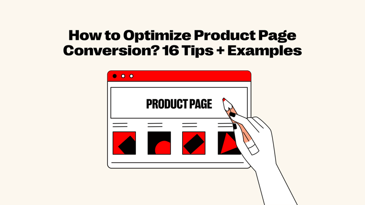
You know that feeling when you're about to close a cupboard and it slams shut perfectly? That satisfying click is what a great product page should do—guide the shopper and slam the sale shut. But here's the thing: not every page pulls it off. Some leak attention, others confuse. In this blog, we’ll break down exactly how to boost your product page conversion, so more browsers become buyers, with no friction in the funnel.
What is the product page?
A product page is a dedicated web page that presents detailed information about a specific item for sale. It serves as the digital shelf where potential buyers can view what the product is, what it does, and why it's worth purchasing. Its main role is to convince visitors to move from interest to action, usually by clicking "Add to Cart" or "Buy Now." It's the final pitch before a decision is made.
Basic structure of a product page
To make a product page work effectively, you need to start with the basics. These key elements should always be present, no matter what you sell:
-
Product title
-
Images or videos
-
Price
-
Description
-
Call-to-action (CTA)
-
Customer reviews
-
Shipping and return info
Once the essentials are in place, it's time to fine-tune for performance. Here’s where things get exciting—these next tips focus on improving product page conversions by making every click count.
How to increase conversion on product page? 16 Tips
From the moment a user lands on your product page, you have a brief 3-second window to capture their attention. The design, content, and layout of this "golden screen" must deliver impact instantly. Fail to impress here, and the rest of your page may never get seen. So, let's see how to raise product page conversions in just 16 simple tips to touch your customers.
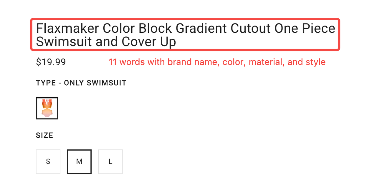
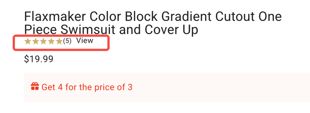
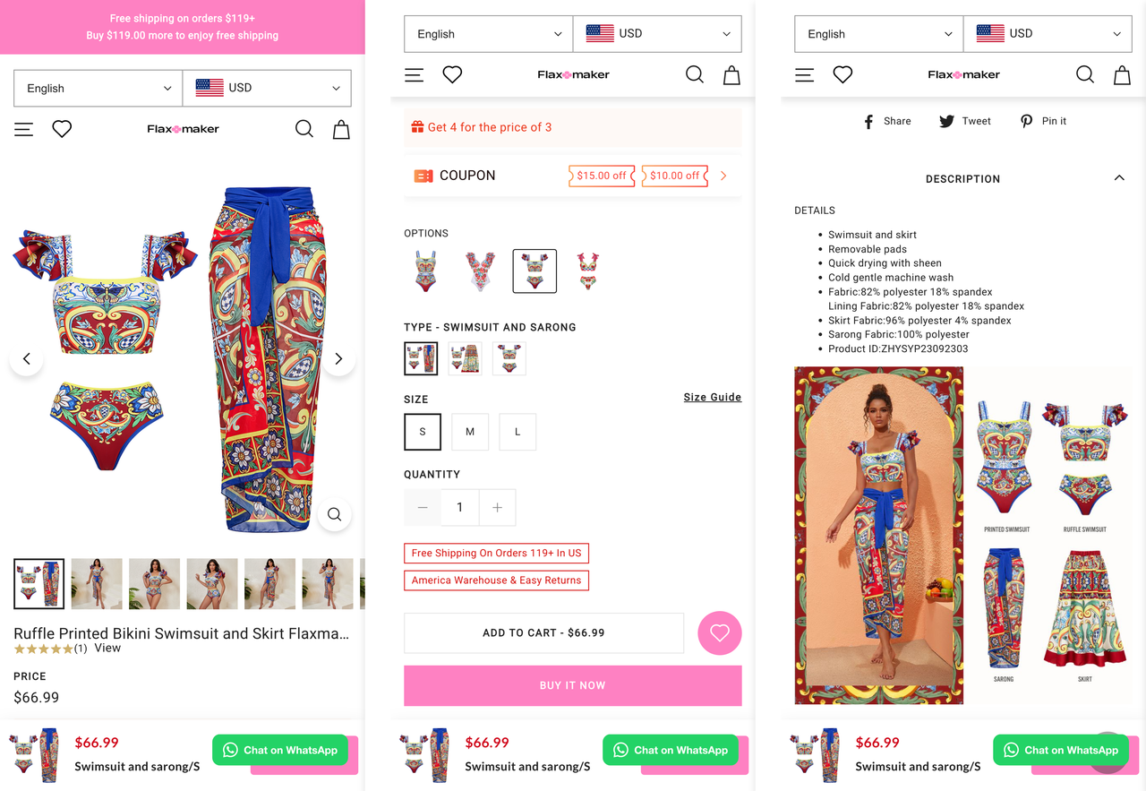
Clear product title
Your product title should sound like something a real person would say, not jargon or lingo. In a word, ditch the cryptic codes and fancy fluff.
✅ Keep it short and punchy—under 14 words, two lines max.
✅ Throw in real and relevant keywords like "100% Cotton Loose Fit Crew Neck T-Shirt", not "Urban Explorer Top".
✅ Mention what matters: material, color, fit, or what it's for.
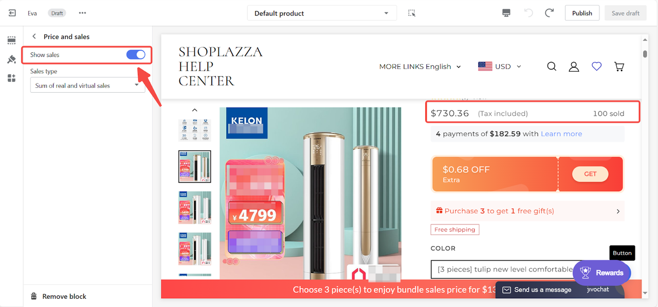
Old favorites? You may drop those star ratings and past reviews right under the title for instant trust. How about new drops? The virtual sales like "100 sold" under the price adds that social proof boosts fast.
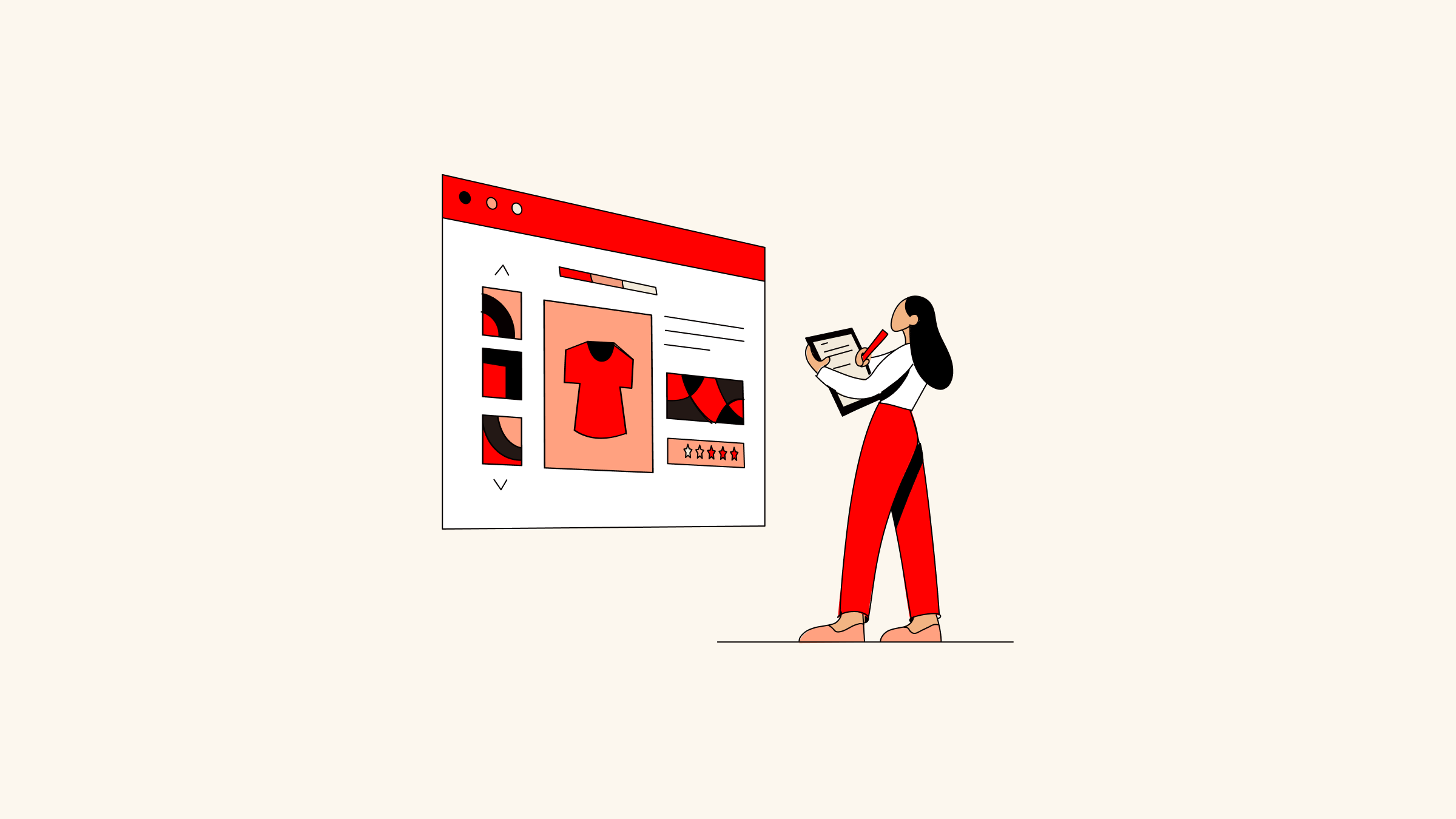
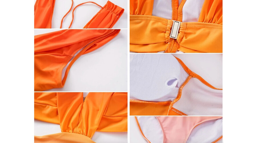
Detailed images
Your photos gotta be crisp, clean, and feel real.
📸 Lifestyle shots: 1–2 bright pics showing the product in action.
📸 Product-only: 4–5 on a white or pure background—front, side, back. For clothes, include on-body shots. For home stuff, show it in different use cases.
📸 Video: If you can swing it, a quick clip brings it to life.
❌ Mention pls: No fuzzy photos, messy backgrounds, or low resolution. They're conversion killers.
However, most sellers just upload white-background shots, a few lifestyle pics, and maybe a model shot—but skip the detailed images. The problem is, when shoppers start really comparing, it's those close-up details that seal the deal. That's where 📸 detail shots come in clutch.
If you’ve got fewer than 5–6 lifestyle or model images, slot the detail pics into the main carousel on the left/bottom. Otherwise, drop them below as bonus content to back up the visuals.
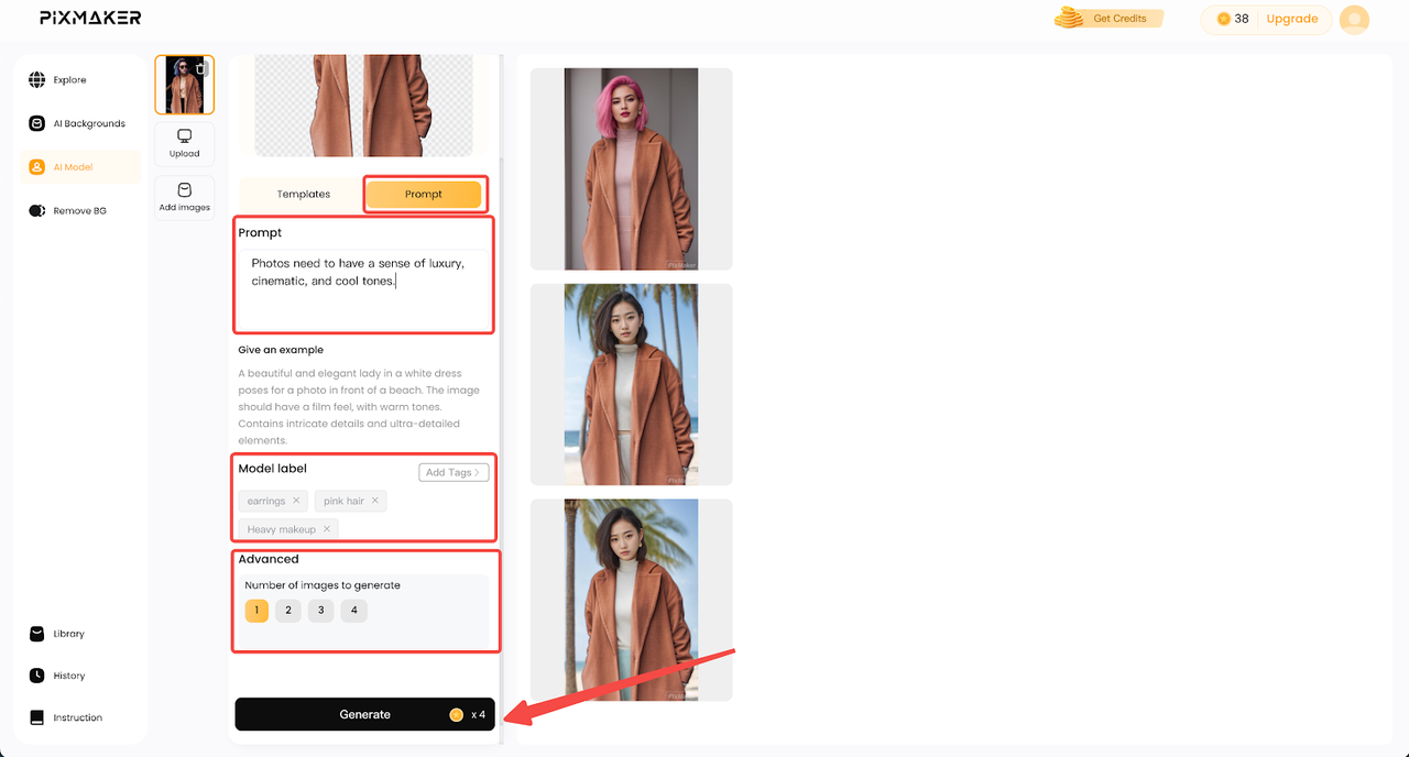
On a tight budget? The
Pixmaker plugin from Shoplazza uses AI to whip up model and lifestyle shots—saves you a ton on photo shoots.
Compelling product description
Product descriptions should be snappy, scannable, and stick in people’s minds.
✅ Kick off with 1–5 lines that set the scene—think mood, moment, or lifestyle.
✅ Use short, punchy bullet points to list fabric, fit, or key features.
✅ Bold key phrases or good stuff so scanners don’t miss the gold.
✅ Aim for 5–10 unique selling points—tight, not cluttered.
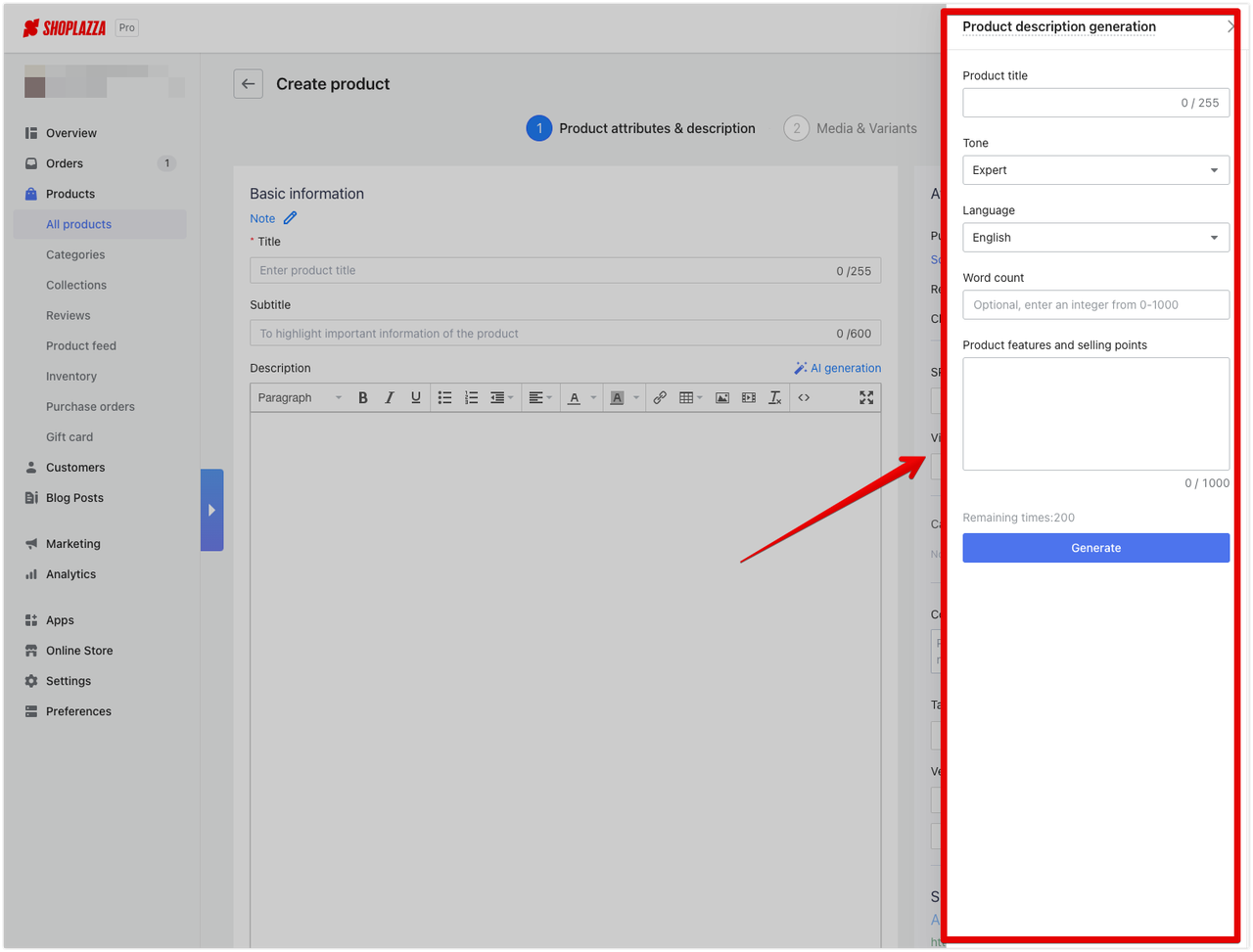
No time to write? Or no idea how to create? Shoplazza’s built-in
AI optimization tool has your back. Just plug in your product title, preferred tone, language, word count, and key features. Hit go, and boom—clean, pro-level copy in seconds. It saves time and nails what shoppers actually want to read.
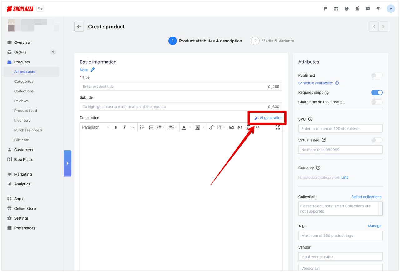
Bonus: It can spit out a polished copy in 16 languages (yep—Spanish, Portuguese, French, German, you name it). Great for busy cross-border sellers.
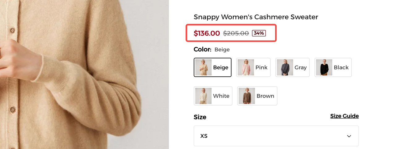
Pricing and discounts
The usual move? Classic price-drop mind tricks. You may show the original price like "$205," slash it to "$136," then tag a red label saying "Save 34%." That instant "sweet deal" feeling kicks in fast.
🤔 What is price drop? It is an act to reduce the selling price, mainly including deduction, discount. decrease, diminution, reduction, step-down.
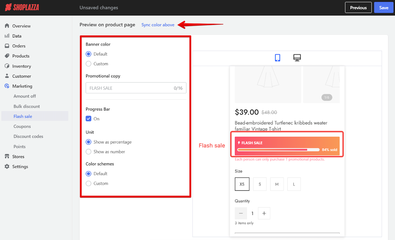
💥 Then, you may add a countdown timer or flash sale for promo deadlines. Nothing nudges hesitant buyers like ticking urgency.
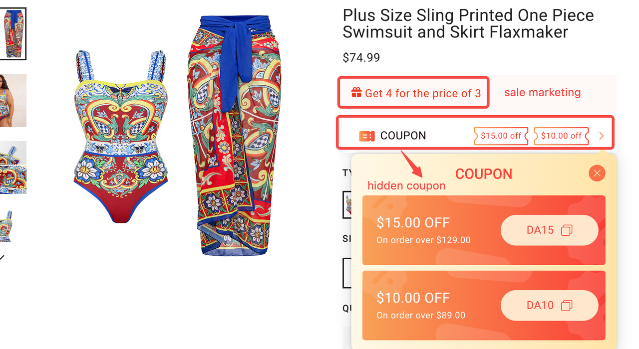
Got more than one coupon? Hidden-style coupons are right below the price and promo section. Users are more likely to click them out of curiosity and favor. It saves space, keeps things clean, and boosts click-through and claim rates.
⚠️ Heads-up: Hidden coupons = higher engagement. They make shoppers feel in control. Auto-applied ones? Kinda meh—your conversion depends more on the vibe.
Inventory "alert" and regular update
Inventory isn't just about storage; it's a powerful sales lever when used right. Instead of showing static stock numbers, you can turn scarcity into urgency with just a few words. You can set dynamic stock alerts like "Only xx item(s) left in stock" to keep that FOMO energy high. No one wants to miss out.
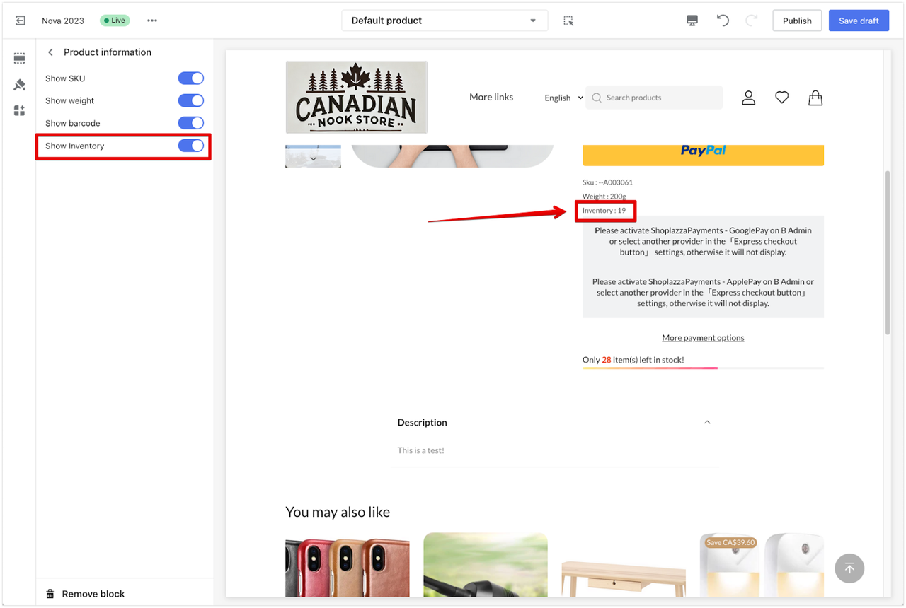
🔔 Pro tip: Go beyond just showing low stock. You can use your backend to control when and how much stock goes live. Time your releases to match those "Only N left" or "Limited-time offer" tags on the product page. This sync builds real urgency and lifts conversions.
Also, you can stagger product drops, like 50 pieces a week in 3 rounds, to avoid overstock and keep hype fresh.
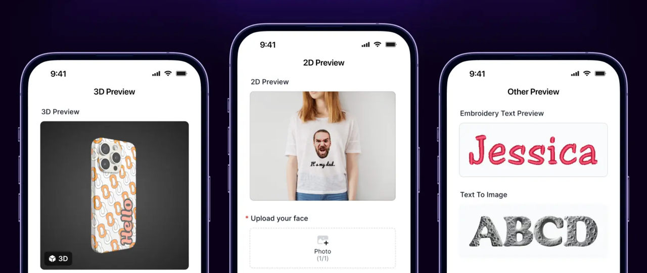
Interactive features (for POD)
Interactive product pages are where the magic happens, especially for
POD (print-on-demand) shops. Instead of just staring at static pics, customers can actually mess around with the product:
upload their images, drop in some text, move stuff around, and see the final look instantly. It's hands-on, fun, and way more personal. And yeah—it seriously helps with product page conversion and bumps up that average spend.
To bring that interactive experience to life without the tech headache, you’ll need the right tools behind the scenes. Shoplazza’s
Product Options plugin makes it super easy to offer stuff like color swatches, text edits, and photo uploads right on the page. No guesswork, no confusion.
 Wanna take it next level? Toss in the CustoMeow plugin. It auto-cleans backgrounds, adds filters, and shows real-time previews in 2D or 3D—for tees, mugs, phone cases, tote bags, keychains—you name it. Plus, it's got built-in upsell tools to lock in more sales.
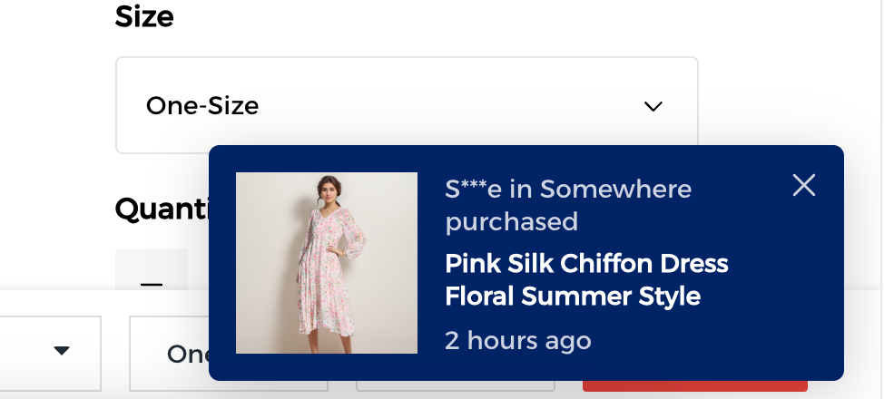
Purchase pop-ups and real-time data
Wanna make your store stand out in a sea of lookalikes? You may try to
create a hot and urgent atmosphere with a bit of real-time buzz, for example, showing how many shoppers are checking out the page. A quick line like
"xx people are viewing this right now" instantly builds that "hot item" feel. It nudges shoppers to act fast and makes your store more memorable.
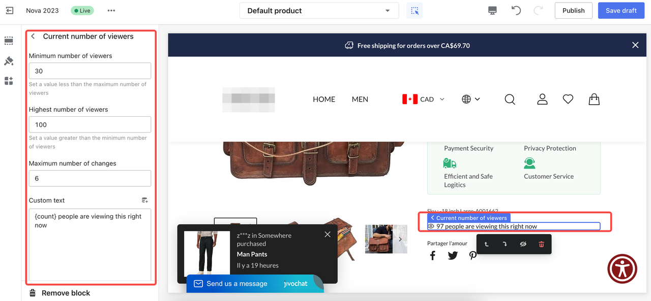
You can also layer on subtle trust signals, like recent purchase pop-ups ("someone in somewhere purchased xxxx 1 hour ago"). These social proof nuggets tap into that herd mentality—when shoppers see others buying, they're way more likely to follow suit.
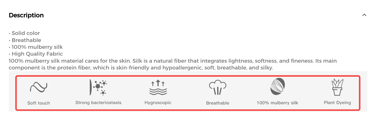
Certifications and icons
Shopping online? A great product's just half the game. What really seals the deal is trust. So, you should show viewers it's safe to buy. Got international creds like FDA or CE? If you have, just flash those badges under the description. Then, turn your top perks into slick lil’ icons, stuff like "plant dyeing" or strong bacteriostasis." Quick to spot, easy to trust, more likely to hit that buy button.
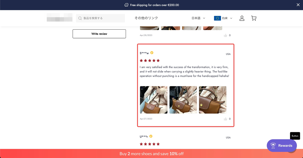
Customer reviews and testimonials
To really seal the deal after building trust and urgency, it's all about showing proof from real buyers, not just stars and stats, but something that feels "human-writing". Good reviews are nice, but real reviews and testimonials are what move the needle. Pics and text? Standard. But toss in a short video review? Now you’re talking.
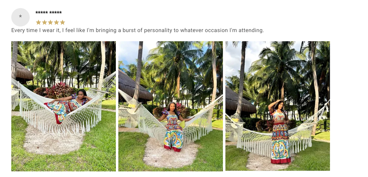
Wanna boost trust even more? Highlight the most helpful ones first.
🗣️ What kind of reviews are helpful? Those that answer stuff shoppers care about, like "Does it run true to size?" or "Easy to match with outfits?" When someone else asks (and answers) the question to them, that hesitation fades fast.
And don’t forget post-purchase follow-up. With Shoplazza, you can set up auto email marketing to politely nudge customers to drop a review after receiving their order. Sweeten the deal—drop a reward like a discount code if their review hits certain criteria. Boom. More reviews, more repeat buys, and a better shot at turning customers into mini influencers.
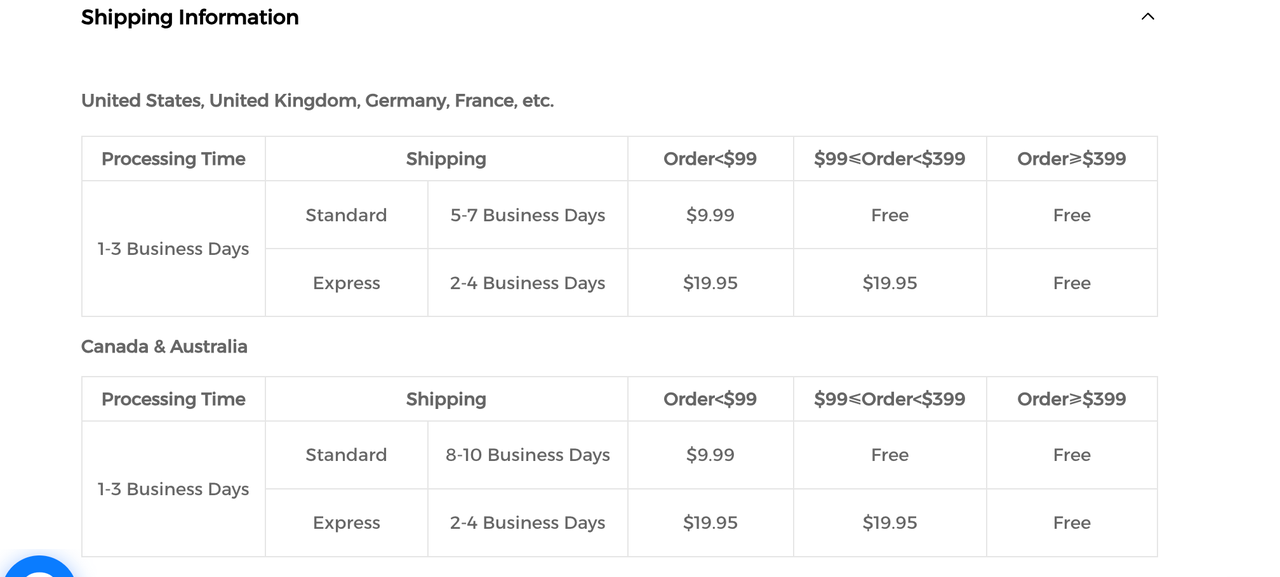
Shipping information
No one wants to chase down customer service just to get the details before hitting "buy."
🚚 Instead of vague terms like "24-hour shipping, 7-day delivery," give more personalized delivery estimates based on location, shipping method, and product type. It feels more authentic and builds trust, making customers feel way more comfortable with their purchase.
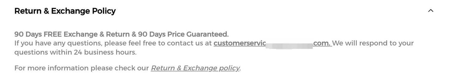
Return and exchange policy
📍 You may clearly outline which payment methods are accepted, whether you offer hassle-free returns, and how easy the return process is. This is especially crucial for high-ticket items. The more detailed the protection info, the more confident customers will feel in making that purchase.
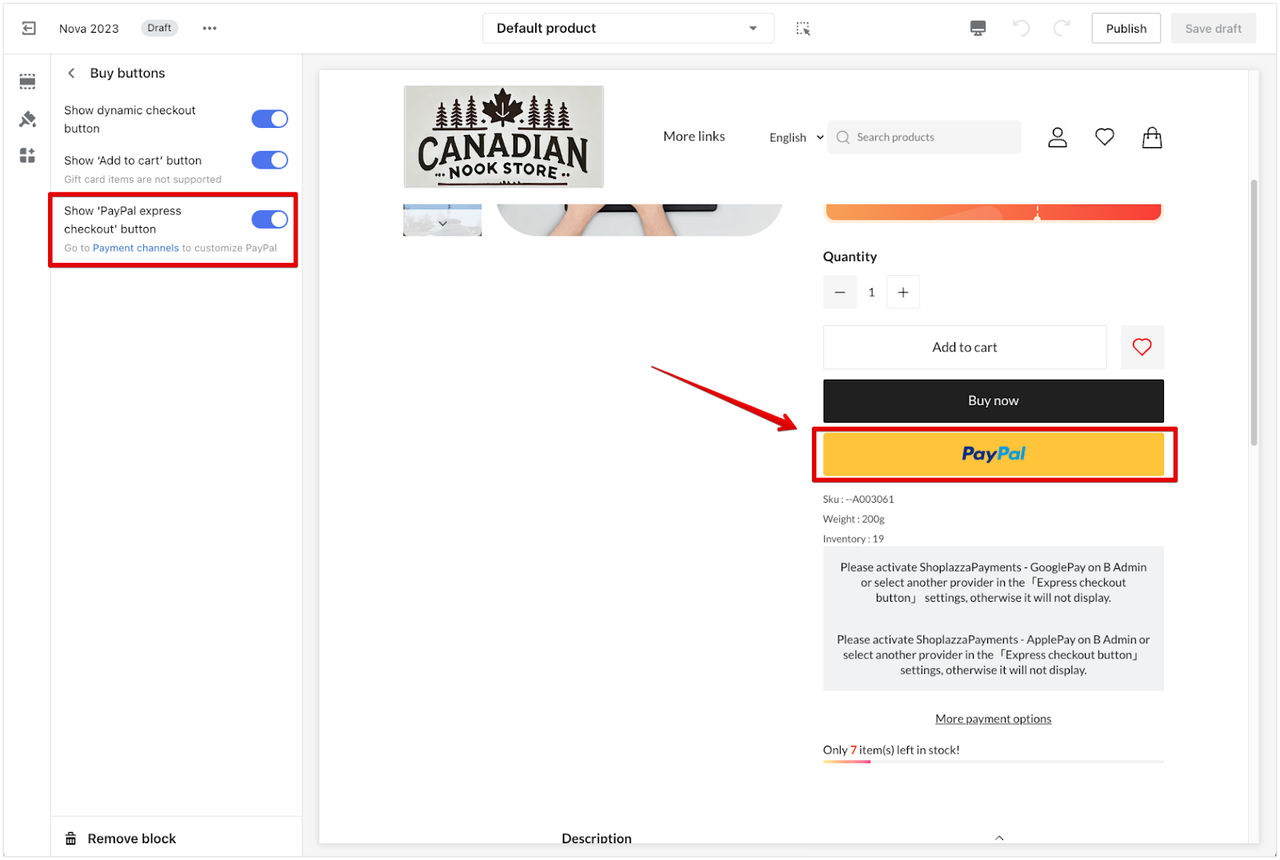
Express payment button
Traditional product pages usually just slap on an "Add to Cart" and a "Buy Now" button—basic and boring. But with Shoplazza, you can plug in flexible express payment buttons like PayPal, PayPal Credit/Debit, Apple Pay, Google Pay, and more. It shortens the payment path big time, perfect for cross-border buyers, and helps cut drop-off, boost conversions, and smooth out the entire shopping flow.
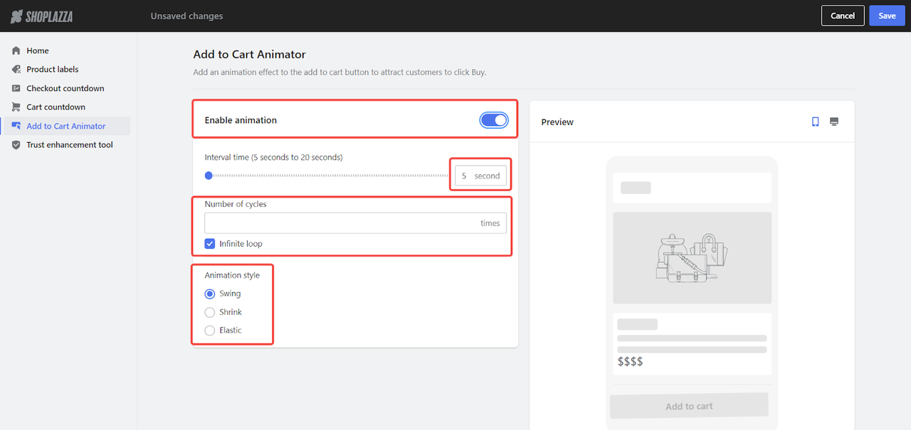
CTA Animator
The usual CTA buttons like "Buy Now" or "Shop Now" are static and kind of snooze-worthy. With Shoplazza, you can spice things up by adding motion effects to your add-to-cart buttons.
⏱️ Interval time (anywhere from 5 to 20 seconds)
🔁 Number of cycles (even set to infinite loop if you want)
🔘 Animation style (bounce, pulse, wobble—you name it)
It's subtle, but it catches the eye and gives that extra nudge to click. Want to stand out on a crowded page? This is how.
Intelligent product recommendation
Most brands stick with the usual "You May Also Like" to upsell similar items, but that's playing it safe. With Shoplazza’s
Intelligent product recommendation plugin, you can go smarter: cross selling to boost full-set purchases and skyrocket your AOV in the process.
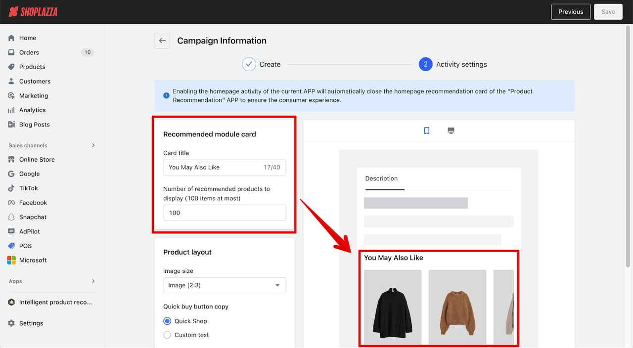
Here’s how you can level up your recs:
👗 Outfit Matching: Suggest full looks (dress + shoes + bag) to encourage bundled buys.
🧠 AI-Powered Suggestions: Real-time recommendations based on user profiles + product relevance.
👥 Similar User Logic: Show what people with similar tastes are buying; it taps into that social proof effect.
🎯 Personalized Picks: Tailored suggestions based on behavior (higher accuracy, better conversions).
And when do you want total control? Here can help:
🔥 Best Seller Priority: Auto-sort by sales volume to put hot items front and center.
🎨 Collection-Based Order: Expose items in your preferred sequence to tell a visual story or thee.
📍 Manual Pin-to-Top: Feature specific products in key spots, unaffected by rules or auto-sorting.
With this mix of smart AI and manual control, your bestsellers, styled picks, and campaign items all get their chance to shine—right place, right time. Ready to tee up that perfect combo?
Live chat
Product page conversion optimization isn’t just about design and layout; it also includes a seamless shopping experience. No one likes waiting hours for an answer. A live chat they can tap anytime means instant help, zero guesswork. You can hook it up with an FAQ bot to handle the easy stuff, and boom—you’ve got a chill, high-speed support system that feels human, keeps folks happy, and gets them to hit that buy button faster.
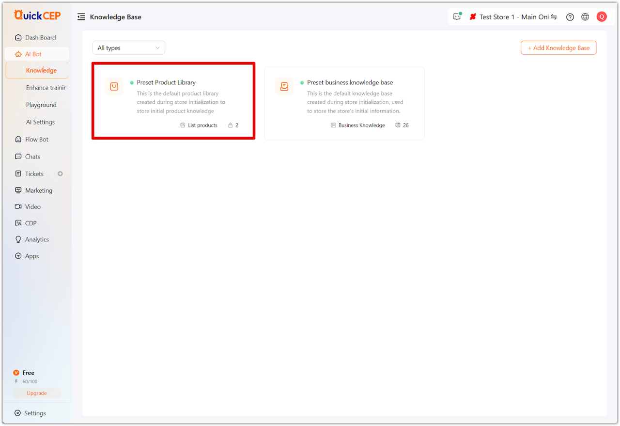
QuickCEP
QuickCEP uses AI to scan your product features and brand vibes, builds a custom knowledge base, and powers up your chatbot to handle customer questions like a pro. Fast replies, zero burnout—more time to focus on growing your store.
📌 Perfect for sellers who wanna cut down on manual support without losing a personal touch.
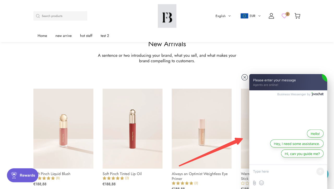
JivoChat Live Chat
JivoChat Live Chat covers the basics: real-time messaging, social media integration, and simple CRM features, to keep customer support smooth and steady. No overload, just what you need.
📌 Great pick for lightweight use in smaller indie stores.
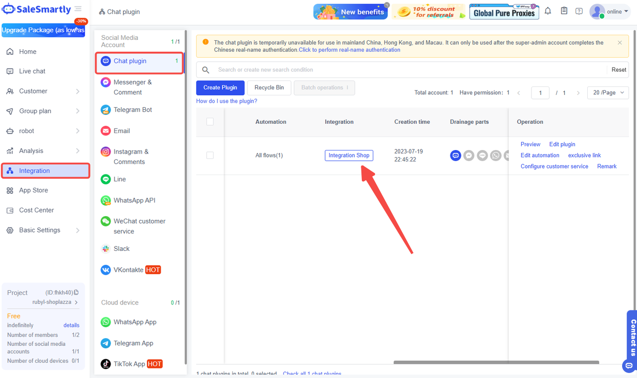
SaleSmartly
SaleSmartly is an all-in-one powerhouse that integrates Livechat, WhatsApp, Facebook Messenger, TikTok, Instagram, Telegram, Line, Email, and even VKontakte, letting you reply across platforms from one place. Whether it's marketing, customer service, or sales, it's got everything in one go.
📌 Ideal for mid-to-large indie stores or brands going global.
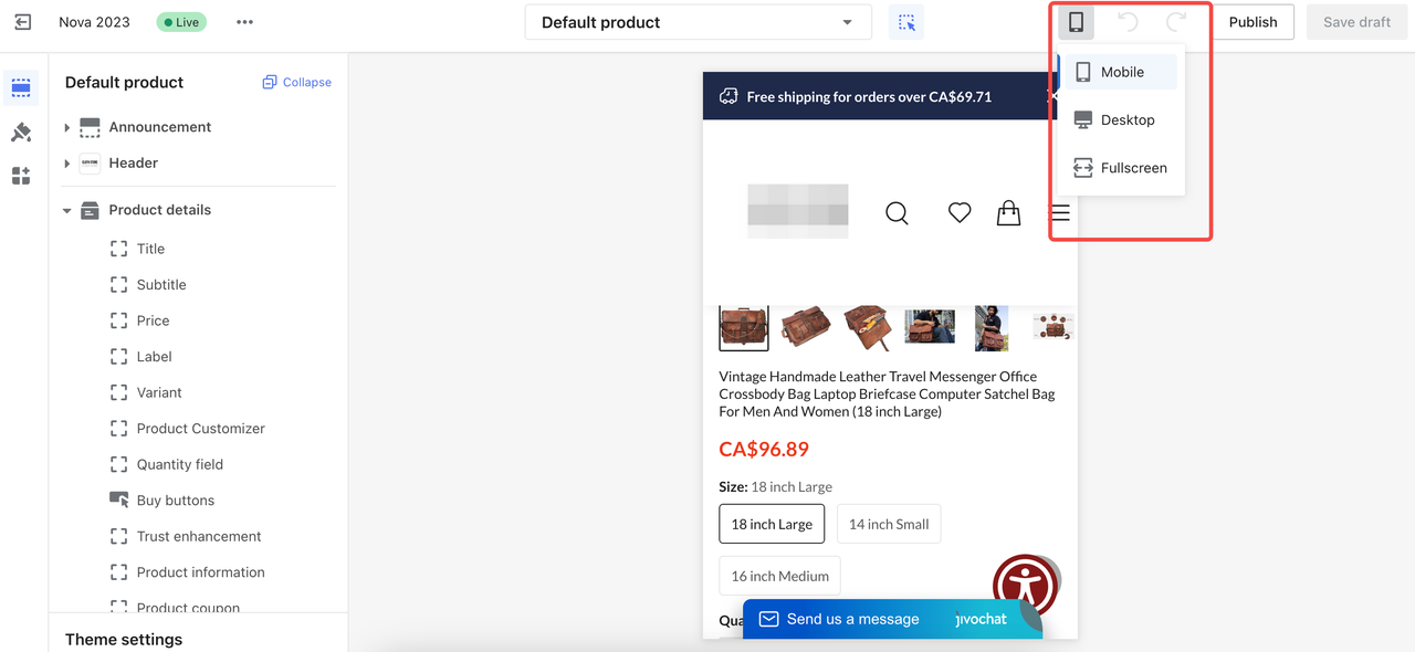
Mobile-friendly design
Now, when it comes to mobile, a smooth shopping experience is just as important as on desktop. Here’s a quick layout tip to help boost your product page conversion rate: follow the three-finger principle to optimize your mobile pages.
✅ 3-second info grasp: Make the first screen clear and straightforward.
✅ 3 screens for core selling points: No endless scrolling to find the good stuff.
✅ 3 exposures for key buttons: CTA, favorites, share.
This ensures that users can easily grasp the value of the product and are more likely to hit that "buy" button. Also, try adding gesture-based interactions, like:
✅ Swipe left to view more product details (if available).
✅ Pinch to zoom on product images for a closer look.
✅ Swipe horizontally through product images for a smoother browsing experience.
If you're using Shoplazza's backend editor, you can instantly preview how your page looks on mobile. It's a one-stop solution to help you perfect the mobile shopping experience.
Build and optimize your page now!
Ready to level up your
product page conversion? While most platforms like Amazon give you basic, cookie-cutter templates, Shoplazza has your back with both default and
custom theme options. The drag-and-drop design makes it super easy for anyone—yes, even beginners—to craft a killer product page. Want to go all-in on personalization? Just hit "Add block" or "Add section" in the backend to tweak and design your page exactly how you want. It's all about making your page pop and getting those sales rolling!